When you think of a movie like The Matrix, what hue comes to mind? Probably the iconic green. That slight green tint that runs through every scene isn’t just a coincidence, it’s actually a deliberate choice and a part of what is more widely known as color grading. It’s not just about making a movie look ‘good’ but more about making it feel right. Whether it’s a romantic drama filled with warm hues or a dystopian thriller soaked in cool grays, the visual tones play a massive role in storytelling.
Using the right colors goes beyond movie-making. All your favorite entertainment websites, like the casinos you find on fair-casinos.com, use particular hues to achieve their desired effect on the user. In cinema, colour grading is one of those behind-the-scenes tools that shapes how we experience a film emotionally. But what exactly goes into this process? How do directors and colorists use it to bring a film’s atmosphere to life? Let’s look at the rich world of cinematic color grading and uncover the magic behind those unforgettable visual tones.
Why It Matters
Before we look into how to color grade, it is essential to understand what is color grading and why it’s so important in filmmaking and storytelling. At its core, color grading is the process of adjusting and enhancing the hues of footage during post-production. You might also come across the term color timing. This is an older analog method of achieving similar looks, back when movies were chemically processed rather than digitally adjusted. This is different from color correction, which fixes technical issues like poor lighting or incorrect white balance. Color grading, on the other hand, is about storytelling, its mood setting, emotional crafting, and genre defining.
How A Hue Builds Atmosphere
Filmmakers don’t pick colors randomly. Every hue is chosen to push the story forward. Let’s break down some emotional associations with colors:
- Warm Colors (Reds, Oranges, Yellows): These colors are often used in romances or coming-of-age stories. The shades create a feeling of warmth, nostalgia, and passion.
- Cool Colors (Blues, Greens): They are perfect for thrillers and dramas; they can create a sense of calm, sadness, or detachment.
- Monochrome or Desaturated Palettes: Mostly seen in post-apocalyptic films or war dramas to bring out bleakness and grit.
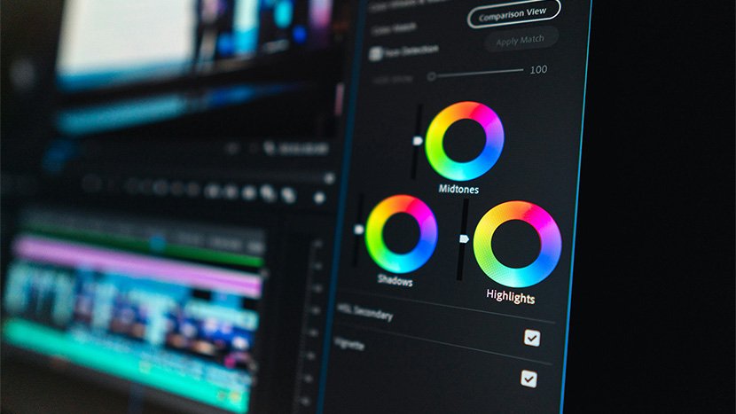
How to Colour Grade Like the Pros
You might be wondering how you can also achieve this in your storytelling, or maybe how to color grade video like the movies? It starts with some software tools, however, the real magic lies in the creative choices made by colorists. Here are a few popular grading techniques:
- Teal and Orange Split: A favourite in action films like Transformers, this method uses teal for shadows and orange for highlights. It enhances skin tones and makes actors pop against the background.
- Bleach Bypass: This gives a gritty, washed-out look and is commonly used in war movies like Saving Private Ryan.
- High Saturation and Contrast: Found in stylized films like Scott Pilgrim vs. The World, colors are bold, and contrast is sharp.
- Retro Faded Look: This, as the title suggests, gives a nostalgic touch to the scenes and is often used in indie dramas. Softens the image and reduces contrast for a vintage feel.
Whether you’re adjusting the hues in your first short film or looking into color grading video projects, or even just curious, it’s good to remember that the hue isn’t just seen but also felt.
Real World Example
If you’ve ever wondered why every blockbuster looks the same, it’s not laziness, it’s because teal and orange are complementary colors. Human skin typically falls into the orange spectrum, and when placed against a teal background, it creates a pleasing and dynamic contrast. Now, if you’re wondering what is colour grading, this is a perfect example. It’s not just about stylization, but also helps drive the story and emotion. This method has become almost synonymous with modern-day action films, making it a go-to look for studios aiming for the cinematic punch.
Just like in film, many other digital platforms also rely on visual tones like cinematic grading to set the mood.
Famous Films and Their Signature Hues
Let’s take a look at some iconic examples of film tones done right:
- Blade Runner 2049: The movie is dominated by blues and vibrant neon oranges. It’s a futuristic world with a touch of decay.
- Mad Max: Fury Road: High contrast, hyper-saturated desert tones give this movie an adrenaline-fueled dueled chaotic vibe.
- The Revenant: With earthy blues and whites reflecting the cold, harsh wilderness, the movie taps into the protagonist’s loneliness.
Each of these films didn’t just choose a look, they built an entire atmosphere around their color grade scheme.
From Raw to Radiant
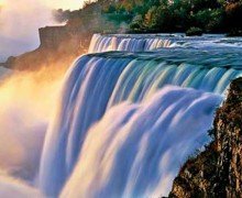
If you’ve ever looked at before-and-after comparisons, the difference can be astonishing. For example, looking at pictures of and visiting some Canadian landscapes may evoke very different feelings because the digital representation you see online doesn’t offer the same hues that you’ll see with your own eyes. Similarly, raw footage can be dull, flat, and uninspiring. But once it’s been graded, it becomes visually rich and emotionally charged. Here is what a typical video color grading workflow might look like:
- Correction: This fixes exposure, white balance, and contrast.
- Primary Grading: Adjusts global tones to match the film’s desired mood.
- Secondary Grading: Tweaks specific colors or objects without affecting the entire image.
- Creative Effects: Doing this adds vignettes, lens flares, or grain for added style.
Conclusion
In the end, if you’re looking for just the colour grading meaning, you will find nothing. This is far more than a technical process, it’s a creative language. It’s what gives Schindler’s List that haunting black and white weight. It’s what turns In the Mood for Love into a rich, sultry experience with its saturated red. Every choice in the grading suite is another brushstroke on the canvas of a film. If you’re a filmmaker or content creator, learning the actual color grading meaning can open up a whole new world of visual storytelling. Even small adjustments can change the way your audience feels and remembers your work.